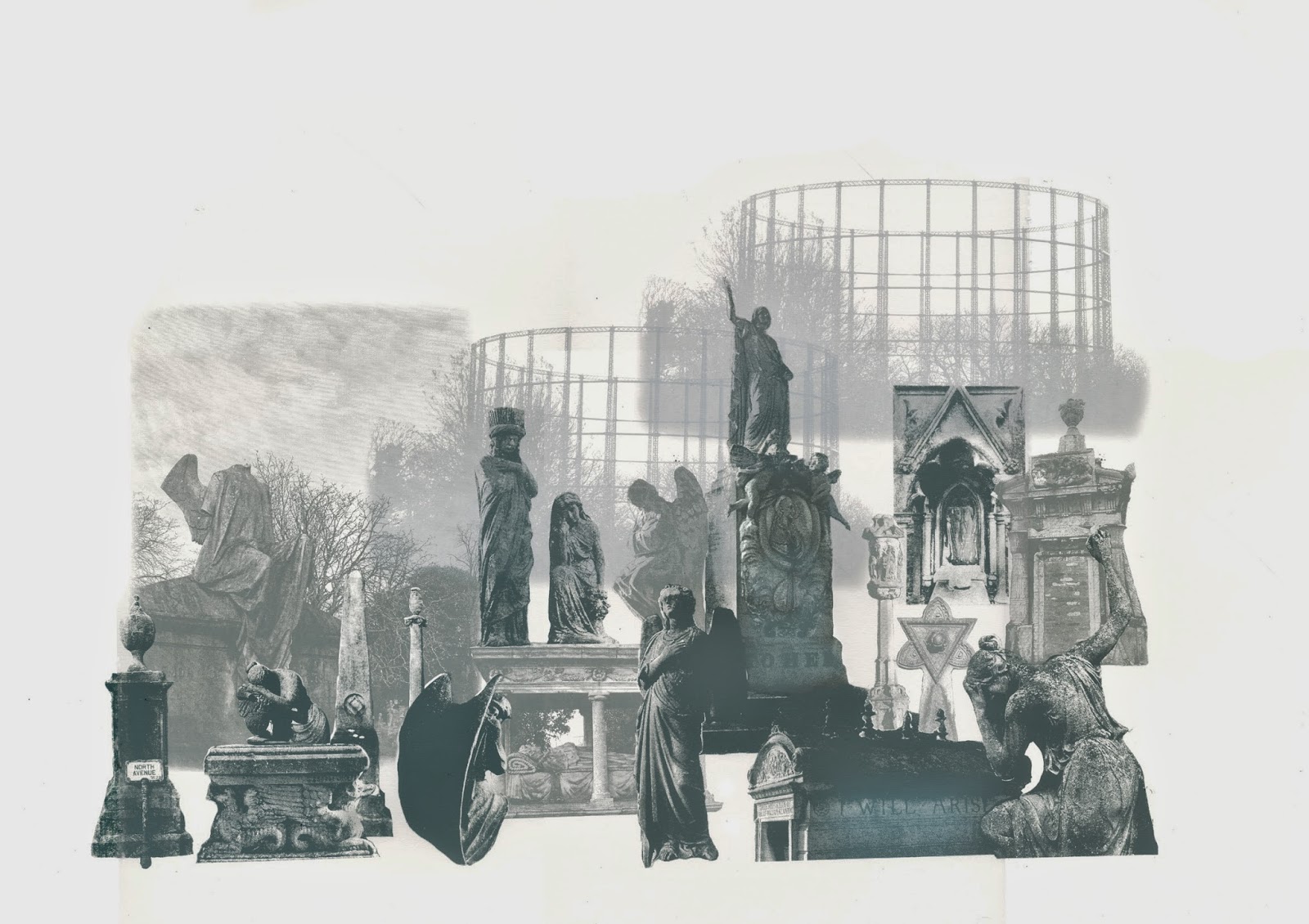
Playing around with type and graphics on the cover image. I have been experimenting with the shape that I drew on the map of London plotting my route. I think it's working well around the type as the cover looks a bit sparse with the type just isolated. I think the final image is going to be the cover. The position of the type and the graphics weren't quite right on the others...
Wednesday 30 April 2014
Monday 28 April 2014
I'm now in the final stages of my project...I'm putting the type and artwork together in inDesign. It would be so easy to play around with this forever but decisions need to be made at some point! It's been so useful to print the document out a few times to see how the type sits on a physical page as it's a very different feeling to viewing it on screen. Unfortunately I saved over a lot of my edits but her are some examples of playing around with position, justification and tracking of the text. The images at the end are examples of what the final designs are looking like...
First attempts, I think there is too much text in one block. It needs to interact more with the images
First attempts, I think there is too much text in one block. It needs to interact more with the images
Breaking up the text a bit and using justification. It looks ok on screen but printed out the text looks a bit to wide and spread out so the tracking needs adjusting...
Getting there!
Saturday 26 April 2014
Today Dad and I mapped out the route of my trip around London according to the order of the illustrations I have included in my book. Luckily the route went pretty much from north-west, to south-east, to south-west, to west, then back to north. It made a pretty interesting shape that I think could be worked in to the book somehow...
Thursday 24 April 2014
Tuesday 22 April 2014
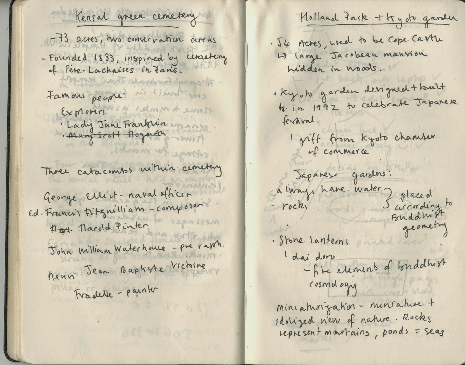
Book inspiration! I found this book by the collage artist Martin O'neill and it's pretty much exactly what I want my book to look like! It is a saddled stitched booklet with printed cardbaord cover and off white pages, slightly smaller than A4. I'd like my book to be slightly bigger perhaps and, instead of a cardboard cover, just have a printed cover on a thick stock of paper. I think it's important for my book to be quite modest so it's still lovely to feel and look at but not intimidating. I want it to be easily approachable and readable. Here are some images of the O'neill book, the illustrations in them are great too!
Friday 18 April 2014
Last day in the print room before I go home, yay! Just been printing some photos that could be used as end papers, cover possibilities and filler pages for the book. I love the texture of all of these however some of the dreaded moire patterns that Graham also warns me about have appeared in a few of the prints, bitmap problems....
Subscribe to:
Posts (Atom)


