Saturday 29 March 2014

Planning my print for St. Dunstans in the East....This should be fairly straight forward to print. I just want to show the empty shell of the church and some nice textures collaged along with my drawings of plants that are taking over the building. The colour scheme I think will be mossy green...


Friday 28 March 2014

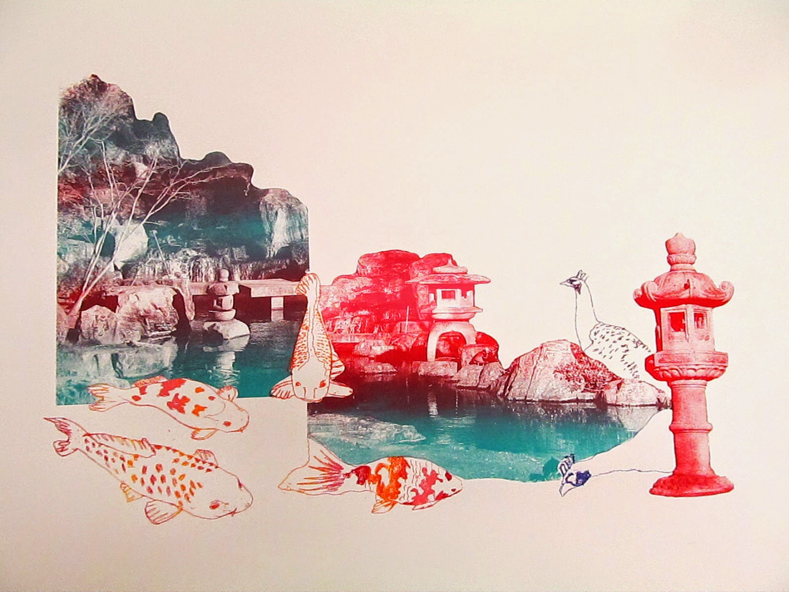
Here are my results from the print room for the Kyoto garden print. I was mixing the colours on the screen again to create a gradient affect, so it was more like a painting than a print. I was trying to evoke a natural, mystical feel, taking inspiration from Japanese seasonal colour palettes. I think the print really captures the surreal, magical feel of Holland park.


Thursday 27 March 2014

I've carried on working with this Buddhist temple print but with little success...I've moved away from the pastel colours, trying to use more punchy colours and giving more focus to the photo. I think I might need to move on for now though and come back to this with a fresh mind.


Monday 24 March 2014

After my roll with the colours for the neasden print, I'm finding this one difficult! I think I got a bit carried away with the pink/yellow/blue colour scheme and this has ended up looking a bit too candy cute, airy fairy. I printed some without a background but I thought this looked to plain as I don't have a print yet with a full background texture. The photo I'm using in the background isn't coming out wonderfully though, I think the positive is a bit dodge...


Sunday 23 March 2014

Colour inspiration for the kyoto garden print. I found this amazing book, 'Kimono as art: the deigns of Itchiku Kubota', which as the title suggests, featured lots of incredible kimonos that are really masterpieces. The idea behind miniature japanese gardens is that they're an idealised vision of nature and I think these Kimono designs also capture that...


Saturday 22 March 2014

The next illustration I'm working on is the Kyoto garden print. I really like my mono prints of the Koi carp so I think they're important to include, also they're unusual for London. I was really inspired when I photocopied some of my photos and blew them up. The pictures of the concrete lanterns suddenly looked so 1960s blown up in a grainy b/w photo. I'm exicted to turn the composition into print!


Friday 21 March 2014

I'm using collage again to work out a composition for the Wimbledon temple illustration. The building shape is important here to show the Thai influence, along with the figures from the garden.


Thursday 20 March 2014

I am working on the composition for the kensal green cemetery print. In terms of colour this should be fairly straight forward as I just want to use shades of grey, probably 2 or 3, to evoke an eerie atmosphere and sense of perspective. I'm really keen for the gasometers to be a main feature but at the moment I'm having trouble making the composition work as a whole. I like certain areas of the collage so maybe I can create the illustration in pieces and put it together in the book but I'm not sure...I think I'll have another go at it at a later time.